My visual puzzle partner was Kyle, my friend and coworker, and I chose two puzzles from the list for us to try that looked like they would be fun to figure out. The first was to count how many squares could be made by connect dots that were in a cross shape, and the second was to see which of the patterns could be traced in a continuous line without crossing back over the same path. We both took about ten minutes to work on each of the puzzles, and these are the results:
With this puzzle the strategy used is filling in because you must be able to see that there can be a series of squares made be connecting the dots with lines. If we were unable to close in on the connection of the dots in the blank space, we would not be able to find all of the squares that are possible. Neither of us were able to come up with the correct amount and both came up with 17, when the actual solution is 21 squares. While finding this out, I read that when this puzzle was created in 1893 the original solution was 17 and it was not for several decades before the solution was updated to 21, so I did not feel so bad about not finding them all.
The next puzzle was a little bit more tough, and the strategies employed were first finding the correct way to travel through each of the patterns without having to cross over the same path. On some of the patterns it was easier to close in on the correct path then others. The next is pattern completion because even though there are many different starting points for tracing each pattern, there is only one correct way to trace each one, if possible. This means we had to complete the pattern from the start to finish.
Thursday, October 27, 2011
Thursday, October 20, 2011
There is a hierarchy
Looking at a hierarchy of feature channels, I find the Aaron Ross Pro model complete BMX bike from Sunday in the Watermelon colorway to be a great example. Starting with the parts that jump out the most, the pink wheels are the first thing that grab my attention because they are big, bright pink circles. The bright pink contrasted on the solid black make this the feature channel that is at the top of the list. Next my eye follows the neon green frame to the pink cranks with the green pedals. This happens because the pink color seems to just explode off the green frame, making these parts really stand out. The pink grips that sit high up on the handle bars are one of the last places that my eye travels because they are one of the smallest areas of the color on the bike. The pink parts seem to be the first channels that are visible because of the popping color, with the eye flowing from back wheel to crank, to front wheel, then up to the grips. The last channels that are visible are the black seat because it sticks up above the rest of the bike, hanging out by itself. The eye seems to trace from the left bottom corner to the right, then up to the top, back to the left until the middle, then following the frame back to where the handle bars meet the the frame, ending the flow of feature channels.
Thursday, October 6, 2011
From the Top...
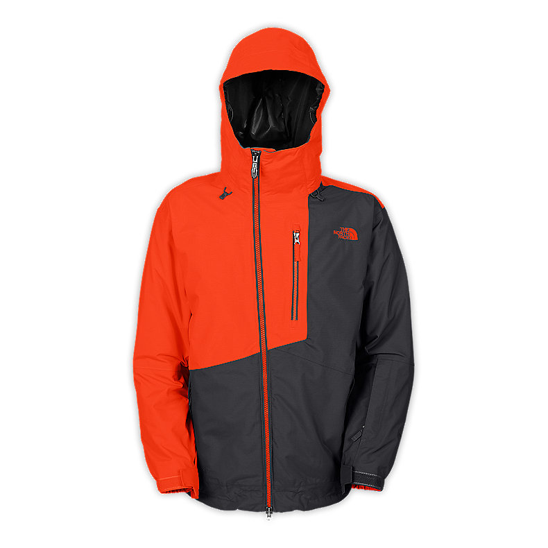
Looking at top down perception influencing product design, I found some great examples in jackets made by The North Face (www.thenorthface.com), with the exemplar being the Men's Gonzo Jacket. The contrast of the bursting orange outer shell on the solid black liner in the hood command your attention at first glance, hinting at the notion that this is the most important aspect of the garment, since this is where the consumer's face will be. This is very important because that is where the consumer wants the attention, on themselves. The next movement made by the eyes is down the chest of the left side, where the split in colored fabrics travels in a vertical line. This feature leads the eye down the front of the jacket until the edge of the orange section starts to head right and crosses the middle of the jacket, where the zipper is. Having the contrast of the vibrant orange zipper on the dull grey leads your eye in a vertical path again, until you reach the waistline, where the material ends. At this point your eyes have reached the bottom of the product and begin to go back upwards along the orange sleeve to the hood, and the process is complete.
Wednesday, October 5, 2011
To Succeed or Fail
For a product that succeeds in applying the guidelines of a targeted user group, I would like to look at the Polaris Ranger RZR. When anyone looks at this machine, the first thing they are going to perceive is that it is very sporty and rugged because of it's aggressive stance, the front end sitting slightly lower then the back, and that the working components are all visible. The RZR has a great balance front to back with the seating area having as much room in front as it does behind, and the top to bottom balance is slightly weighted towards the bottom, which gives the machine a lower center of gravity, giving it higher stability. The stress is seen in the way that the bottom half carries a lot of bulk in plastic covers and metal parts, while the top half is very light and airy. The front end of the machine definitely shows the more level end with it's solid flat edges and calm colors, while the rear end has a more sharp feel because it grabs your attention with it's bumpy surfaces and bold graphics. Even though there is a large area for the operator to enter and exit the cockpit, the mesh door panels keep the feeling that the body is solid and connected, while also being light and airy, contrasting the heavy feeling front and rear.
As for a similar product that I feel does not exemplify what a target user would want out of this type of product, I am looking at the Yamaha Rhino. When first seeing this machine, the perception is that it must be slow and unstable since it sits at a completely flat stance, giving it a meek attitude. The top to bottom balance looks a little skewed since the rider sits at about the midlevel of the vehicle, giving it a top heavy look and keeping the center of gravity high, making it appear unstable. The front to back balance is far heavier on the rear end, since it sticks out a lot further from the end of the tire then the front does. There is not much stress in the vehicle, everything is pretty much plastic covered and the same color, not leaving anything kept "untidy". This also weighs the level attributes higher then the sharp, since most of the vehicle is solid and flat, with the only variation being the ridges and polygonal cut outs on the door. There is little contrast in positive and negative since the doors cover up most of the small cut out, giving the machine a very boxy look.
Subscribe to:
Posts (Atom)