Tuesday, December 13, 2011

My only friend, THE END

Contrast, instability, irregularity, complexity, intricacy, exaggeration, activeness, accent, variation, distortion, depth
Harmony, Balance, symmetry, regularity, simplicity, unity, predictability, neutrality, consistency, flatness, repetition 

What we are looking at here are two great examples of products that have utilized a great combination of visual techniques to convey their visual message. The first is the Troy Lee Designs D3 Speedwing bicycle helmet and the second is a pair of Electric EG2 snow goggles. I chose these two products because they both are conveying the message that the athlete that is wearing either of these is concerned with their style. To begin with the helmet, the vibrantly contrasting yellow and blue grab your attention right away and draw you into the instability and irregularity of the details of the helmet. The goggles have a more subtle approach, with a similar hue of blue used for all components of the goggle, and do not call too much attention to the little details of the ghost faces. Why I think that these products are working well is because they both have utilized the contrasting or harmonizing aspects to tie everything together. The helmet would not have the effect of looking like it were ripping through space if it did not have the activeness and accents of the line work throughout the design. The goggles would be a plain blue rendition of a snow goggle that has been done time and time again, but the surprising details around the frame and on the strap are what make this a successfully designed product.


Wednesday, December 7, 2011

◊CONTRAST◊

A design that shows great contrast is the Glenmorangie Pride 1981 single malt whiskey decanter and coffer. The glass decanter was designed by French glassware designer Laurence Brabant and the wooden coffer was designed by Dutch designer Wouter Schueblin. The contrast is seen in the materials chosen for the set, starting with the smooth glass set against the grainy wooden box. The clear glass shows the light tone of the whiskey inside, while the solid wooden box's dark sides reveal nothing until it is opened. The glossy metallic clasp matches the neck and cap of the bottle, but is offset by the rough texture of the suede liner inside the coffer. Even though there is a similar hue between the components of the set, their tones are are contrasting enough to push each subtle difference to it's own level. Even with all of these opposing and contrasting elements, there is a balance to each aspect of this product. Each component's contrast to another works as a complement for it at the same time.
As for a product that has a poor use of contrast, I am looking to a product that I personally have an issue with. I am a bicycle mechanic by profession and I use a set of hand tools on a regular basis, so I chose to buy Chraftsman tools because they have a lifetime warranty. I really enjoy most of the features of their tools, but one type of tool that I have a problem with are the screwdrivers because I can not tell them apart easy enough. While working on a bike, I often have tools scattered on a work bench and I need to be able to grab the correct tool from the pile without too much effort. This is a problem with the flat head and phillis screw drivers because they both feel the same in my hand, and the only way to tell at a quick glance is with the red stripe that is painted on the outside of the flat ones. There should be more contrast in the shape of the handles, possibly changing one from a round shape to a rounded rectangle on one of the styles, or making the sizes drastically different enough that it would be easy to tell the difference. With just a small tweak to the contrast between the different types of screwdrivers, I believe these could be much more successful products.

Monday, December 5, 2011

Gas, Brake, Drip Drip

The very first product that came to mind for me as one that has motion implied is the Yamaha R6, because I have always felt that this motorcycle looks like it is hauling ass when it is parked. I owned this bike when the current generation of the R6 was released in 2006 and was very compelled to make that purchase because of form and beautiful design of the machine. Starting with the shape of the body panels, having a sweeping curve rising up to meet a sharply aerodynamic tip, and the gas tank which has a larger rear end and smaller front, the form of the bike very sleek and weighted towards the front. The line of the rider and passenger's saddles is parallel to the exhaust muffler, the beginning of the swingarm, the line from the crease in the fuel tank to the bottom headlight, even the decals, all following the same upward angle. This gives the feeling like the bike is almost starting to fly away as it gets towards the rear of the bike, while still maintaing an aggressive forward-leaning stance. This is really the ultimate sport bike of it's generation because of Yamaha's stance that the technology engineered must conform to the aesthetic of the products design, not the other way around. They were able to design and produce a motorcycle that looks like it is moving at an insane rate when it is sitting, while also seeming to solid and motionless when it is zooming down the raceway.  
This next product was something that I had never seen before I started to do the research for this project and it does a great job of looking like it has movement when it is just sitting still. The Liquid Lamp was designed by Kouichi Okamoto of Kyouei Design in Japan. The basic form of the lamp looks like a the shade is a paint bucket  tipped upside down and there is a bunch of paint dripping out which makes up the stem of the lamp. What this lamp does really well to make it look like it is moving is that it has the drips of paint being different lengths and sizes, which gives it a more realistic look. The lamp comes in two different styles, one that is wall mounted and the drip looks like it is running down the wall. The second style has the drips holding up the lamp shade like a desk lamp, with a big puddle of paint on the table acting as the base. Both lamps have a drip that is detached from all the others, leaving a circular drip alone on the wall or desk. This shape being separate from the rest of the lamp gives the feeling that the red part is actually wet and dripping out of the bucket. For a product that gives the feeling of movement while being completely still, the Liquid Lamp is a great example.


Thursday, November 17, 2011

Designers in SPACE

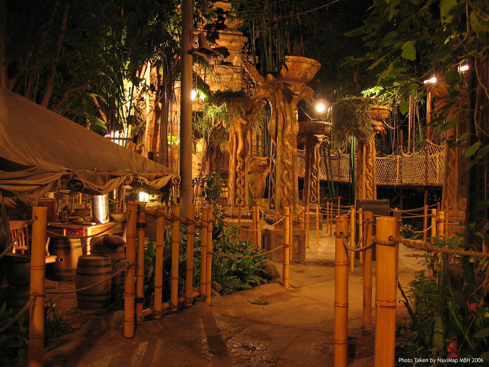
A great example of design operating in space and utilizing that space to it's fullest are the entrance corrals to the rides at Disneyland. Here is a picture of the Indiana Jones ride entrance maze, where you walk through an ancient temple courtyard on your way into the forbidden pyramid. A designer had to come up with a creative way to pack as many people as possible into this area as they wait in line, and utilizing space to it's fullest not only accomplishes this, but also keeps the guests entertained because they have something interesting to look at. For example, the pillars in the middle that have snakes twisting up their sides have the big wide top sections that are all the same height, giving the feeling that there is a roof or a limit to the area and that it does not go on forever. Another is how the props that line the outsides of the set, like the bunch of barrels on the left, are far enough away from the guests that they may look to be real. If they were right up close where you could get a good look at them you might not be as convinced of their authenticity. My favorite is the facade of the temple because from any point in this area it is going to look massive because it is much bigger then anything else in sight. Since you can not see any of the other attractions of Disneyland due to the large jungle canopy this is what you have to scale objects to, and it is pretty big.

Thursday, November 10, 2011

Hey, are those new?

Here is a great example of how a product's tone and color, on this Troy Lee Designs Air Glove, operate to fulfill the user's, a motocross or bicycle rider, needs. If we first analyze tone in this example, the glove from the top has a very light middle section that is bordered by darker tones, defining it's edges. I have always like white gloves because they look classy when they are clean, and a big part of riding is style. If a rider feels confident in the way they appear, it adds to their confidence when they ride and lets them feel more comfortable.The darker tones are patterned on the thumb and pinkie occupy the whole finger section, while the ring and index finger have the darker tones inset in the light middle section. The palm of the glove is completely dark, giving it the opposite look as the top. Having a dark palm is necessary on a riding glove because if it were light it would show all the dirt that is constantly being rubbed into it. I think that there is a great integration of the light tone of the strip that lines the inside of the fingers that directs the eye from it's beginning at the tip of the index finger and moves to the pit and back to the tip of each finger. When looking at color, I think the first way I would describe it would be like a fun house. The colors all have a soft feel, with their hues being complementary. These types of colors work well for a rider because they are going to do a couple of things, the first is not being too vibrant. There is a point that color can cross when being worn by a racer where it starts to talk a little bit louder then they can, which can be a bummer. These colors can be seen, but are not so bright that you would be seen in the dark. I think that the color of the red and blue shapes on the fingers work well because they break up the big white area where the fingers are and flow well with the direction of the hand.
http://www.troyleedesigns.com/product.php?cat=61&id=19736

Thursday, November 3, 2011

Product Designer

SHAPE:
The base for every design is rooted in the basic shapes, and being able to utilize their characteristics for what each of them have to offer. In this example of a rapid viz sketch for a new wood clamp design, it is clear that the designer has started with the basic circle, square, and triangle, and exaggerated their form to fit the function of the wood clamp. The handle is made of two semi circles for ergonomics, the clamping mouth has a square profile to make the bite more effective, and the hinge is made of two over lapping triangles. Without a grasp of the form of each of the basic shapes, a product designer will be unable to apply the user's needs to the reality of a tangible product.

SCALE:
For a product designer, scale is very important to the design process because it will fully effect the success of the end product. If you get the size of elements of the design out of proportion to others, the product will not have a consistent design language and the user will not be able to read it. One of the spectacular new advantages available to product designers today are rapid prototyping machines like 3D printers, which can produce design prototypes of an scale, smaller then the end product and even up to full sized components. This tool is amazing for a product designer because they are able to produce their designs into tangible objects at a fraction of the time it would take with traditional methods. With the ability to create each component of the design to full scale, a designer today should never have the problem of producing something that just doesn't fit.

LINE:
Starting at the beginning of every design are lines, that are connected to make shapes. This process, as it may sound easy in the previous statement, is very difficult to visualize without the proper understanding of how individual lines will be able to construct a solid object. The image above is a CAD drawing that I made for the Intro to Computer Drafting class and I believe that it is a great example of how line is used in the design process for a product. To start this drawing I had to join lines at their endpoints perpendicular to each other in order to form the square shape. I also had to utilize parallel lines to project the top view of the component to the front view. 

Thursday, October 27, 2011

My visual puzzle partner was Kyle, my friend and coworker, and I chose two puzzles from the list for us to try that looked like they would be fun to figure out. The first was to count how many squares could be made by connect dots that were in a cross shape, and the second was to see which of the patterns could be traced in a continuous line without crossing back over the same path. We both took about ten minutes to work on each of the puzzles, and these are the results:
With this puzzle the strategy used is filling in because you must be able to see that there can be a series of squares made be connecting the dots with lines. If we were unable to close in on the connection of the dots in the blank space, we would not be able to find all of the squares that are possible. Neither of us were able to come up with the correct amount and both came up with 17, when the actual solution is 21 squares. While finding this out, I read that when this puzzle was created in 1893 the original solution was 17 and it was not for several decades before the solution was updated to 21, so I did not feel so bad about not finding them all.

The next puzzle was a little bit more tough, and the strategies employed were first finding the correct way to travel through each of the patterns without having to cross over the same path. On some of the patterns it was easier to close in on the correct path then others. The next is pattern completion because even though there are many different starting points for tracing each pattern, there is only one correct way to trace each one, if possible. This means we had to complete the pattern from the start to finish.